GoAnimate is an online platform that enables people to create professional-looking videos — from scratch — using drag and drop tools. It helps businesses and consumers to tell their stories in an engaging and cost-effective way.
In GoAnimate, there is a feature called “Template” where user can drag & drop a ready made scene with backgrounds and characters included in it. This saves users time to create a scene from scratch.

Since the launch of the Template feature, we were happy to find out that a lot of users quickly adapted to use Templates to help them create videos more quickly. However, through watching user testing videos, we have identified a few usability issues we would like to address.
My role
I was the lead UX designer for this project, and worked along side with another UX designer and one engineer. I executed user-testing sections, interaction desgins, user journeys, wireframes, prototypes and design specs.
The Process
Understanding the problem
We ran 6 rounds of user testing sections through Usertesting.com, below is a summary of usability issues we identified based on user testing sections:
1. Lack of visual hierarchy. Since Templates and assets (individual items such as props and characters) were grouped together visually, some users had mistakenly identified certain Templates as an asset to be added on the stage.

For example, one user has mistaken a Text template as a way to add text to the scene. Hence, when they click on that template, everything that is currently shown on the scene is replaced by that Text template. Although this the correct behavior for selecting a Template, but not what the user was expecting. As we can hear verbally from the user how confused she was.
2.Difficult to navigate between Templates categories. With the old UI, users had to choose a Template category very carefully, because if they cannot find what they need in one category, the only way to browse another category is to click the Back button and select another category.

Imagine you were on hunting mode, where you really wanted to find something urgently, and you had to hit Back multiple times because each category you clicked did not contain what you want. It starts to become irritating very quickly. In short, the old deign has high interaction cost which a good design should always try to avoid.
Understanding stake-holder needs
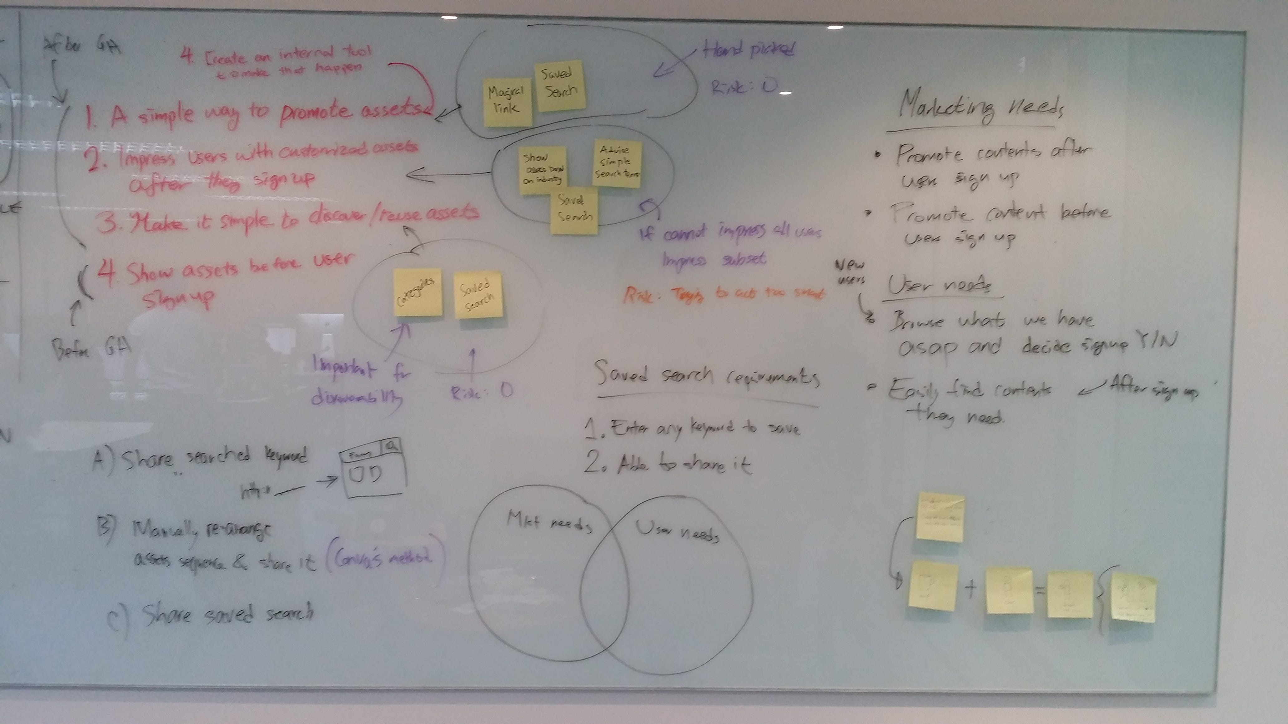
Apart from serving our user needs, it is also important to take into account different stake-holder needs. Our marketing team said that they wanted a way to promote certain templates based on seasonal (e.g. Christmas specific) or user’s job roles in order to give users a more personalized experience. With that in mind, I sketched out the user and marketing needs on a whiteboard and shared that with the team.
Setting the North Star
Before we started to work on anything, we needed some guiding principles that everyone can agree upon. This helps us to evangelize ideas, gain alignment and drive decision making.
When we asked our users why they chose to use our tool instead of our competitors, many pointed out that “Using Goanimate is much quicker”. Indeed speed is a feature on its own. We quickly decided that speed is the number one thing that we should care the most.
Everything that we were going to work on will be about helping users to create their first video in a shortly manner. Our design must be able to promote featured templates without slowing the user down.
Sketching out the User Journey
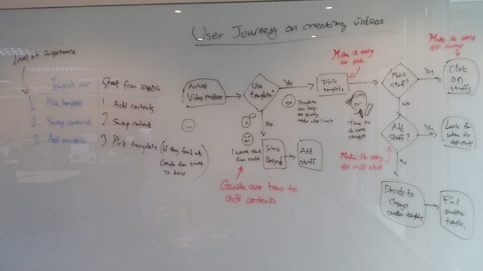
We want to understand what challenges a new user might face when they first came to our tool, sketching the joruney out helps us to identify area that users might need help with. These helps may came in any form (micro copy, contextual help..etc)
Brain storming ideas
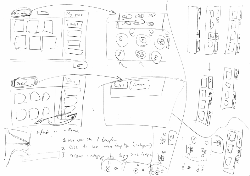
It took us a long time to find the right solution because every sketch I made seems to not satisfy our goal, which was to:
- Have a clear Hierarchy.
- Easy to navigate between templates.
- Able to promote certain templates.
In the end, something sticks. We took queue on browsers tabs designs, where the tabs will be our categories. It is easy to navigate between tabs and we can pin certain tabs just like in browser to promote some templates.




Paper prototype & Interaction design
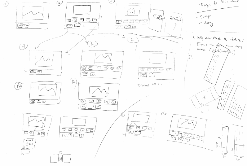
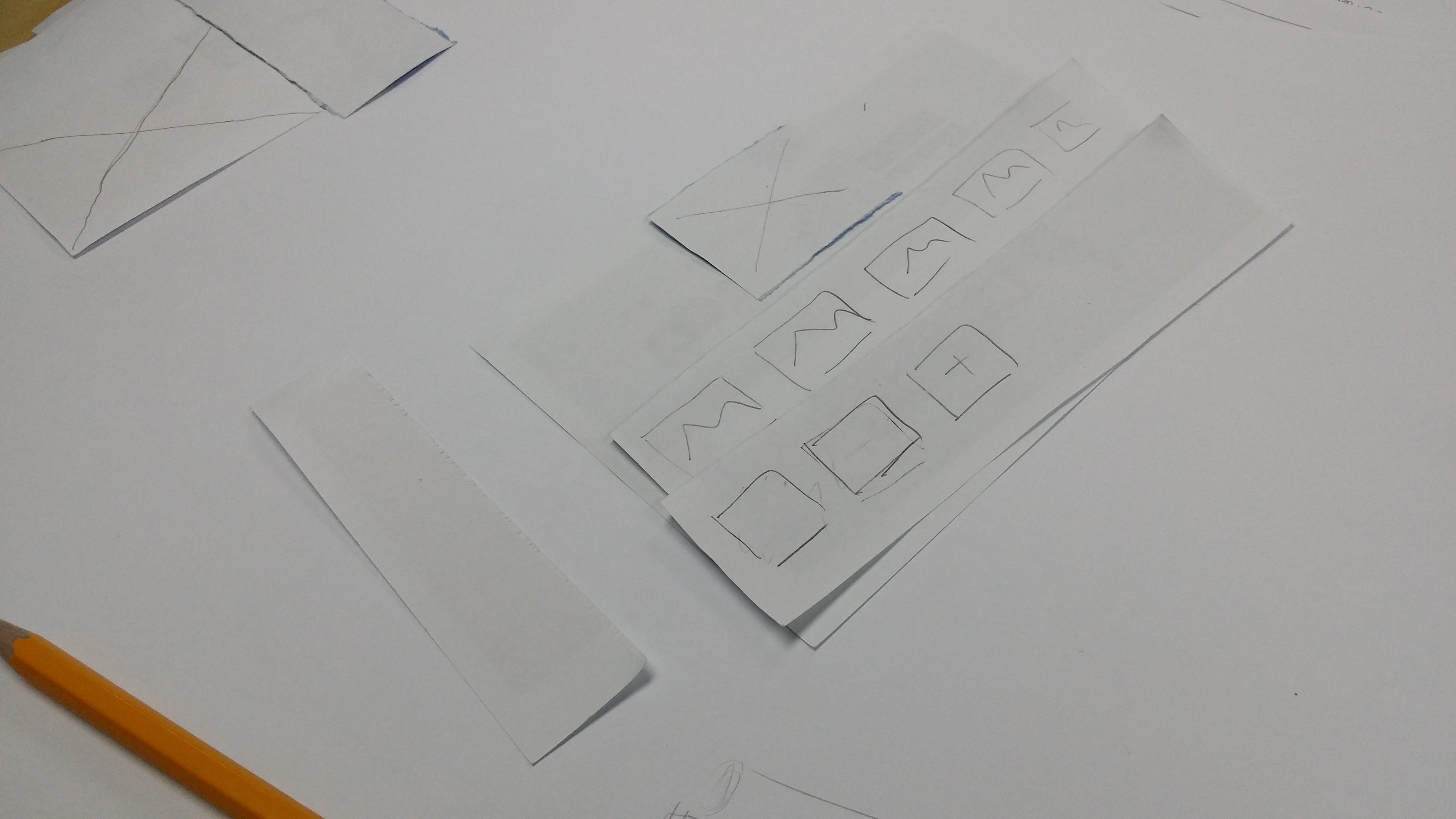
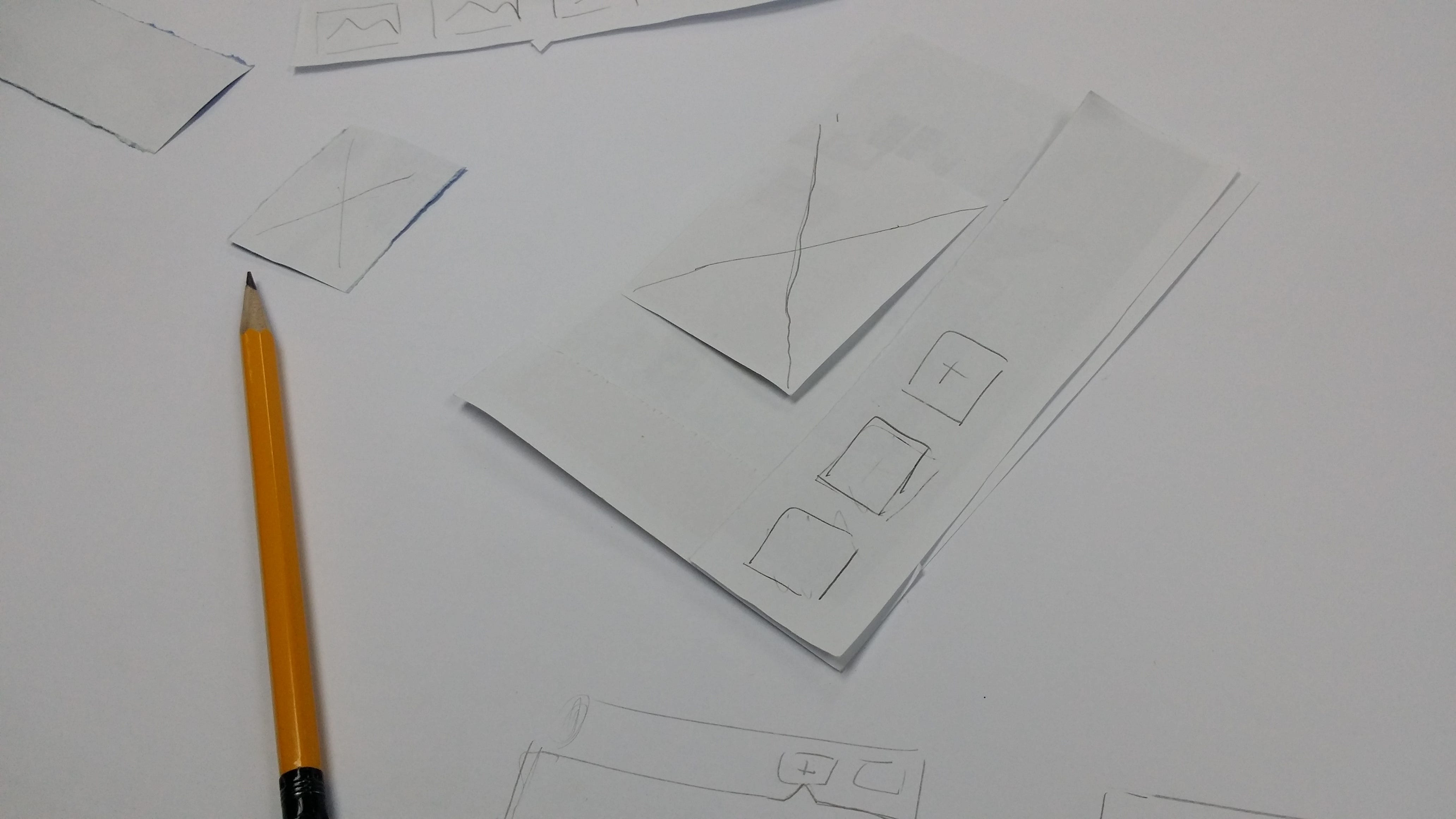
We quickly jumped into creating a paper prototype to test out our ideas. We cut out the pieces to help us understand where the template menu should belong in terms of structure and layers, where it would come from when summoned and where it would go..etc.
Interaction design
I used Atomic to create an interaction design prototype and presented it to the team to communicate how the template menu should behave. I collected feedback and did a few variations. Below is the final design:

Functional prototype
We worked alongside with our engineers to create a working prototype. We presented this prototype to our stake-holders, including our CEO, while explaining the problems we are trying to solve and how this designing is the right solution. Once we got everyone on board, we then moved on to create the real thing.

Functional specifications
At this stage I prepared a document called “Functional specifications”, it documents how the feature is suppose to behave and also the design decisions we made along the way.
Some designers advocate on not writing specs and prefer to use wire-frames and prototypes as the final spec. I am also not a big fan of heavy spec, however I find the process of writing the spec forces to me to think about the problem more clearly. Flawed logic is also easier to discover when you put the interactions into words because you are not distracted by anything fancy.


The final product
Below is the final product and the problem it addressed:
1. Clear Hierarchy
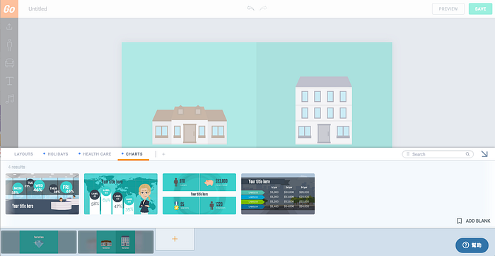
We have moved the Template menu to the bottom of the UI, shown when user clicks the Add scene button or click the Swap scene button. With this new UI, the case where users mistreat Template as an asset and accidentally replacing the current scene will no longer happen.
Putting Templates at the bottom makes the adding scene interaction much more intuitive because users are most likely to want to see templates when they want to add a new scene (Triggered by clicking on the Adds scene button). The Template menu now show up when users need it and stay out of their way when it is not.

2. Easy to navigate between categories
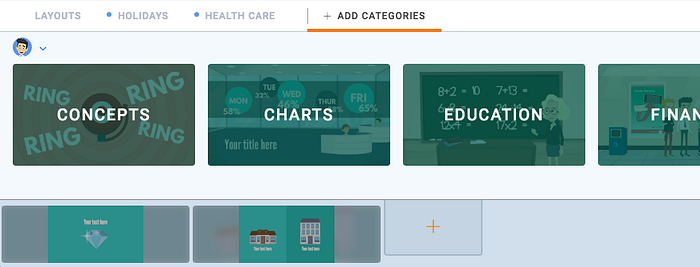
We have introduced a Tab feature that works very similar to a browser tab, users can easily navigate between categories they care without the speed bump from the old design. They can also customize their work space to show only Template categories that are relevant to them, and hide those that are not.

3. Addressed the marketing need
We don’t want first time users to be overwhelmed by the number of Template categories out there. Hence, by default, we only show a few starter categories, or categories for promotion to help users quickly get started. This approach helps to promote certain categories without coming as too “salesy”.

User testing follow up
We ran a few more user testing follow ups to see how well the new design went compared to the old one. We were happy to see that all users were able to distinguish the difference between templates and other assets. The starter templates helped the users to easily get started and they had no difficulties navigating between templates.

Results
While I cannot show you the sales number, one of the things that made me proud of my job is seeing how customer appreciate the work we put out there. Below are some of the praise that we receive since the launch of this project.
“Sweet mercy the new editor is AMAZING! The level of fine-grain control that we have over elements now is fantastic, and the intuitiveness and responsiveness of the interface is fantastic as well!”
“I’m liking the new alpha video maker format. Particularly the time line which makes it easier to visualize the sequence of actions than the older format.”
“Just by the interface alone it is night and day better…”
“ know using it is at our own peril since it’s Alpha, but I’m already using it for production level videos because of how much more streamlined and powerful the new editor is. Fantastic job GoAnimate, you’ve raised the bar once more!”
“I have so much to say! So many things! I’ve been using new UI/UX for about an hour and overall I’m in love! … Anyway, The timeline improvements are huge.”
“User friendly, clear extra simple, but still great quality & tools”
“Hi, congratulation for created great new platform design for testing, which is more light, easy and well organized timeline.”
Lesson learned
Confession time: we actually created the North star (or the design vision) after we started designing the UI. I decided to put it this way in the portfolio because it is easier to follow.
At first, I thought the requirements were very clear and there is no need for a design vision. It didn’t take us long to hit a bottle neck, as the design was going nowhere. Non of us were happy about our sketches because it couldn’t address all our requirements.
It is until we went through a lot of debates and it became apparent we must align our vision. Things started to go smoothly afterwards and we can finally come up with a design that everyone is happy about.
In short: Never cut corners or you will always suffer in the end!
Thank you for reading.
